THE HUNGRY OUTSIDERS
I'd like to start this post, a tough post to write, with a quote by Malcolm Gladwell that makes me hopeful.
"The fact of being an underdog changes people in ways that we often fail to appreciate. It opens doors and creates opportunities and enlightens and permits things that might otherwise have seemed unthinkable."
—Malcolm Gladwell
My first job in book publishing in 2004 was at a liberal indie publisher in NYC. I was hired to design book interiors. I quickly asked if I could try designing covers, but was told I could design covers “for fun” but that they wouldn’t be published. Lacking opportunity there, I just assumed I would find it in a different place. Almost everyone in my office was white. All the decision makers were nice white liberals. And even though I'm a Latina, I thought nothing of it.
I had on what I now call “rose colored blinders”. That’s when you imagine things are great the way they are, because you think if you just work hard, success will come find you. You think that talent and hard work can earn you success, even if you lack connections and mentors. Kids of color often lack these two very important rungs in the ladder of success. Soon I got a job at a larger publisher. My manager hired diversely, but I was oblivious to how rare that was in publishing. Again, I thought nothing of my singular status, maybe because even in college my design courses were 90% white students. It seemed normal.
Publishing is very polite and I had few conversations about race on the job. I didn't want to bring attention to my "too niche" identity because I figured that was unprofessional, so I never brought it up. Thankfully the Obama presidency and all the racial debate that surrounded it helped change that. Since then race is discussed a bit more openly than before, something my younger self never would have imagined.
Early in my career, I was STARVED for diverse role models and diverse mentorship, and sometimes I still am. I thought I was alone. I believed that publishing would always underserve diverse audiences. Then I moved into Young Adult and Middle Grade books and got on twitter (YA lives on Twitter) and discovered I had been REALLY wrong. I wasn’t alone. There was a whole new generation of readers who were deeply dissatisfied with their lack of representation in books. And these folks were OPENLY saying so, in reviews and on blogs.
The diversity discussion online now is passionate and can be intimidating. And while the conversations are difficult, I feel deeply fortunate to have stuck it out in publishing to witness them. There is new interest in diverse voices that are squarely hyphenated and American. While there will always be popcorn bestsellers that cast minorities as exotic and foreign, we are also seeing different books. Books that include diverse Americans as three-dimensional nuanced protagonists.
I’m really excited to see what this new era of publishing will look like. Maybe it will look like three of my favorite covers that happen to be inclusive and attractive.
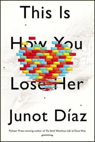
This Is How You Lose Her
Jacket design by Rodrigo Corral
The first is This is How You Lose Her by Junot Díaz. This is designed by the talented Rodrigo Corral (yes I know Rodrigo is not a woman, but I'm making an exception because I couldn't write this post without including Junot Díaz). Rodrigo is known for his stripped down, but high impact, designs. My admiration for this book jacket is primarily because it avoids the exotic “spicy” Latino trope. In this book in particular, which is about love, I think it could have been easy to slip into that stereotypical portrayal of a Latino protagonist. So restraint wins, and so does this great cover that shows the disintegration of bright bricks that represent love.
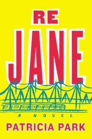
Re Jane
Jacket design by Elena Giavaldi
The second is Re Jane by Patricia Park. This jacket is designed by Elena Giavaldi. It’s also pretty simple. I just finished Re Jane and it’s now a personal favorite. Full disclosure the author and I worked together briefly at that indie publisher. The book is an incredibly nuanced portrait of Jane, a half Korean Girl from Queens around the early 2000's. It deals with the complexity of racial identity in the more diverse recent past in Brooklyn and Queens. It’s the only book I’ve ever read that captured the scarcely gentrified Brooklyn of my youth. It’s hard to imagine now but New York was a different place, where many immigrant groups completely dominated the two boroughs, and where making it meant you lived in Manhattan. Which is why this design is so smart. It doesn’t put undue emphasis on the protagonist ethnicity, but rather it does what the novel does, it focuses on Jane’s evolution, that only comes to the character by moving out of her neighborhood into the greater world, symbolized by the train.
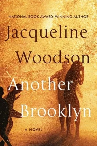
Another Brooklyn
Jacket design by Robin Bilardello
This brings me to another book that I desperately want to read. That's Another Brooklyn, by Jacqueline Woodson. She is an author who has made great strides for diversity in Children's books. This is Woodson’s first adult novel in twenty years. My hope is that the adult market is ready for her. Robin Bilardello designed the jacket, which I think is great. It’s fun, spontaneous, and captures that “let’s open the hydrant” moment that city kids love so well. I can’t wait to read it and see what summer or the hydrant has to do with the book. Which is what you want from a book cover, something that leads you into a great read.
PS. This post was inspired by The Revisionist History Podcast Episode Carlos Doesn't Remember, which is about and the role of an advocate-mentor and connections in achievement.
PPS. You can see more of my favorite covers on my Book Design Heroines Pinterest collection. visit it here.